PopSugar Landing Page - Redesign
💌 Have a project idea? We are available for new projects info@ronasit.com | Telegram | WhatsApp | Facebook | Linkedin | Website
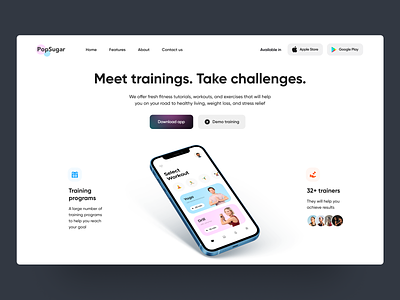
Landing pages are like shop windows for digital product sellers. Here's a landing page promoting a fitness mobile app. What's good about it? Let's see below.
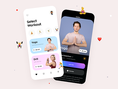
The shot shows a home page providing a brief description of the app and some of its unique features. It has a Call to action button in the upper section that offers to download the app. Right next to it we placed a free session trial button.
The color scheme follows the app brand colors to maintain the brand identity and create a comprehensive look.
The purpose of any landing page is to show the product and make a customer interested in purchasing it. We placed some of the app's advantages and give customers a free trial option so that one can study the features the app has and make a decision to try it.


