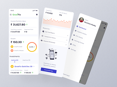
finance: mobile app
Hi there!
- Businesses dream about a simple view that presents all information, shows trends and risky areas, updates users on what happened — a view that will guide them into a bright financial future.
- For me, a dashboard — is a glance preview of the most crucial information for the user at the moment he is looking at it, and an easy way to navigate directly to various areas of the application that require users attention.
For a dashboard to be considered superior, it must satisfy a set of specific UX criteria:
- Clear and consistent naming conventions
- The flow and layout of data prioritized
- Margins are appropriate for readability
- Data is neither hidden nor overloaded
- Understandable and easy to read
What are your thoughts? Drop a comment below!
