Apple Health Redesign

The team is available for new projects! Drop us a line: hello@purrweb.com | WhatsApp | Website
Hey, guys!
Coming back to you with a new shot — Apple Health redesign 🍏⚕️
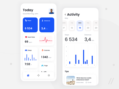
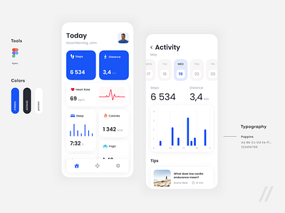
Homescreen is the most important part of any health and wellness app, right?
There the user sees the key metrics:
👣 steps
🏃🏽♂️ distance
❤️ heart rate
🔥 calories
😴 sleep
All the most crucial data about your health clearly displayed 📊
If you open the activity screen, you’ll see the steps and distance by day📆 Also there is activity chart and training tips 🏋🏿♀️
🔵 The main color is blue. We also used different shades of blue to connect all visual elements and achieve the calming effect.
Press 💜 if you like our design and share feedback!
P.S. We already have experience in designing healthcare app, check out our case 😉
Created by Valerian Boyko