Brevan Howard — Concept Direction
New Work
↳
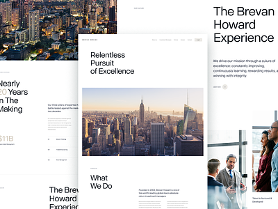
Another early design direction concept we created while working with our client Brevan Howard, a leading global hedge fund.
This minimal direction set rich imagery and simple typography against a breathable white background to create a calm and sophisticated feel. Information was neatly organized to lead the viewer down the page, while using typographic hierarchy to create visual appeal and tension.
Thanks to @Hrvoje Grubisic for the collaboration on this direction.
More by I D O L View profile
Like
