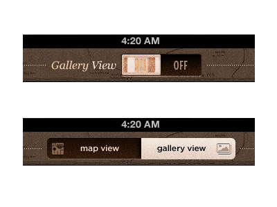
VOTE: Switch vs. Toggle - iPad
** UPDATE it's live - Go forth and download for free - http://canyoncountryapp.com/
I need folks to vote for what they like better from a UX perspective. There are two different home screen views in the App. One UX concept is an On / Off switch. I realize a Switch is not traditionally a UX for changing views within an App. However, the view change will have transition that may work nicely with a Switch 'slide'. The other concept is the standard two button toggle. I could go either way.....
*Note: The App will always load up in 'map view' (assuming it isn't already running)
I'll post two comments below to vote on. I'd appreciate a 'Like' for whichever comment fits your vote. The comment that gets more 'Likes' in the next 72 hrs will be the UX that gets chosen for the App.
Much appreciated Dribbblers! :)
Stalk us on Twitter for updates on this app.
