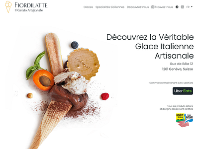
Fiordilatte Geneva Website
I wanted to create a simple, elegant design that captures the users attention.
I used the image from https://unsplash.com/photos/W-p5xm_hGSw and modified it to place the fiordilatte biscuit as a focal element since it showed the artisanal aspect with all the ingredients flowing in, the gelato was similar in texture, plus we didn't have a budget to pull off creation of this image ourselves.
The site is a single page (3 languages available) split up into nice, easy to read sections showing the available produce.
More by Antarctic Design View profile
Like

