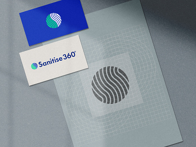
Sanitise 360º - Brand Identity Construction
I designed a minimal logomark for an Identity that I was commissioned for.
𝐓𝐡𝐞 𝐦𝐚𝐫𝐤 𝐬𝐡𝐨𝐰𝐜𝐚𝐬𝐞𝐬 𝐭𝐡𝐞 𝟑𝟔𝟎º 𝐚𝐬 𝐚 𝐜𝐢𝐫𝐜𝐥𝐞 𝐛𝐮𝐭 𝐚𝐥𝐬𝐨 𝐫𝐞𝐩𝐫𝐞𝐬𝐞𝐧𝐭𝐬 "𝐜𝐨𝐦𝐦𝐮𝐧𝐢𝐭𝐲". 𝐓𝐡𝐞 𝐬𝐭𝐫𝐞𝐚𝐦𝐥𝐢𝐧𝐞𝐬 𝐬𝐢𝐠𝐧𝐢𝐟𝐲 𝐭𝐡𝐞 𝐰𝐚𝐲 𝐩𝐫𝐨𝐝𝐮𝐜𝐭 𝐮𝐬𝐞𝐬 𝐯𝐚𝐩𝐨𝐮𝐫𝐬 𝐚𝐬 𝐰𝐞𝐥𝐥 𝐦𝐚𝐤𝐞𝐬 𝐚 "𝐒".
They deal with creating a non-toxic covid free workplace and needed something fresh and vibrant.
Read the full story here -
http://debthedesigner.com/portfolio/sanitise360/
---
My Website
http://debthedesigner.com
Behance
https://www.behance.net/debthedesigner
Instagram -
https://www.instagram.com/deb.thedesigner/
---
More by Deb Banerjee View profile
Like
