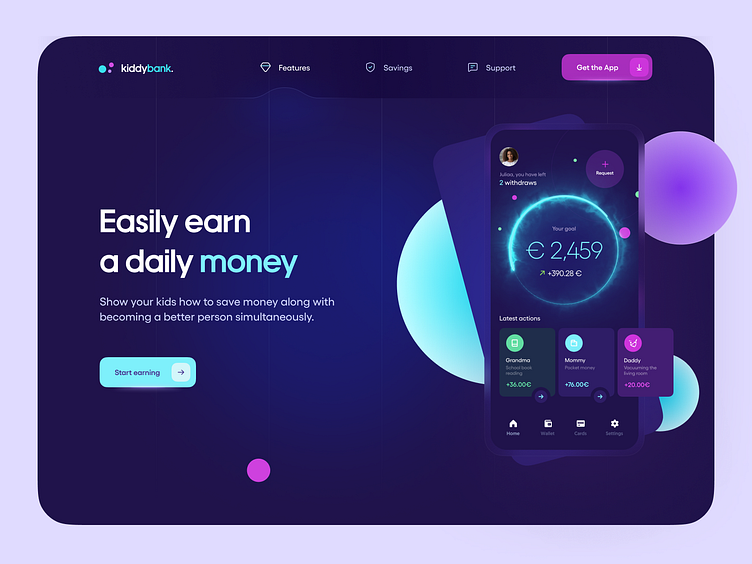
Kiddy bank landing page - fintech for the youngsters
Howdy! 👋 I would like to say that the youngsters are a much harder end customer than the adults why I have been working on the kiddy bank web page. Adults mostly think about the functional itself at first. Hard to predict what youngsters thoughts what would like to see when it comes to a specific business area a specially about banking, like in my current example. They can see hundreds of piggy banks examples. The question is how to achieve product prominence if we have hundreds of them already on the market? I have decided to narrow down the current market UI examples based on that data, I designed a specific UI variation that might steal the youngster's hearts.
I would like to prepare a design that might affect the youngsters either. I have leveraged the facts that youngsters are a totally different group of users than adults. UI here requires a particular variation of why I have been staying face to face with that challenge.
Crafted with love and care – as always. Stay safe! 🙌🏻 We're available for new projects! Drop us a line at ux@netguru.co. — Show us love! Press "L". Want to see more projects? Visit our profile and remember to follow us!
