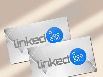
New logo for LinkedIn
I designed a new logo for LinkedIn, starting from the “In” mark, obtaining the two letters as a link between people, represented by the lines and the circles. I changed also the typography, using a futuristic font, and the color palette, shifting to a brighter sky blue and lighter greys ínstead of bold black.
More by Paolo Falqui / BLØPA View profile
Like
