Website - Investors
Working on a new website for venture capital firm. They have 2 target audiences 1) entrepreneurs seeking backing (being the main) and 2) investors looking to invest.
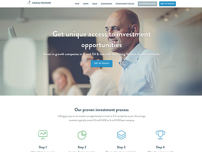
This shot is from the page targeting investors. The copy is still wip.
What are your thoughts on icon colors, green or blue?
See zoomed out screenshot attached.
More by Finge View profile
Like

