Brevan Howard — Concept Direction
New Work ↳
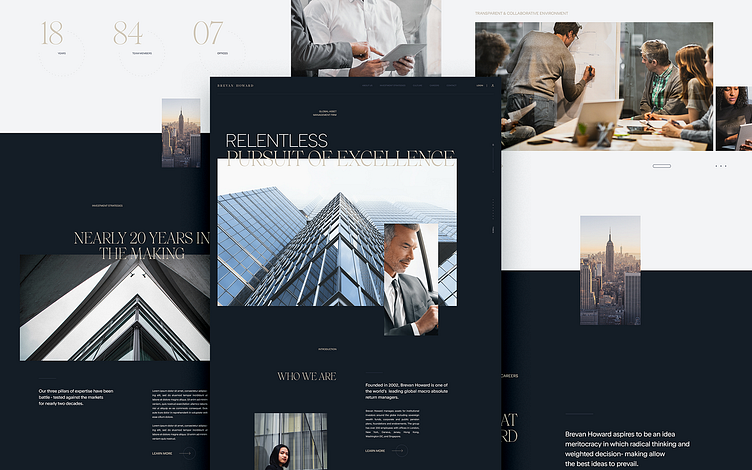
An early design direction concept we created while working with global hedge fund Brevan Howard.
The all caps headlines and dark moody tonality felt a little too modern and editorial, but much of the exploratory work in this concept influenced the final direction.
The irregular grid allowed the content to flow without feeling too constrained. The image-driven layouts paired with slick typography created a contemporary look and feel that differentiates Brevan Howard within a traditionally reserved industry.
Thanks to @stevemcg for the collaboration on this direction.
More by I D O L View profile
Like
