Collective • mobile screens and illustrations
Hi folks ! 👋
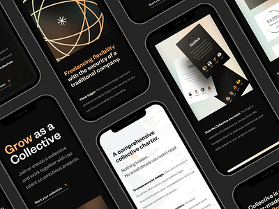
Here are several screens of the mobile version of Collective's website home page sections and illustrations. The mobile website landing page offers to choose two sides, either Businesses or Collectives, and for each side illustrations, content and colors are different ✨
In this shot I've explored different ways of showcasing design with mockups, playing around with layout as well. What do you think? 👀 🎨
👉 Curious? 👀 Check out 🔥 Collective's live website !
***
What is Collective about? While independent freelancers have dedicated platforms, collectives are still underserved. Collective aims to become the go-to solution where the best pools of talent can legally and commercially offer their services and grow their businesses. Join or create a collective and work together with top talent on ambitious projects, on design, development, product fields and others !
Design: Juliette Lagache, Didier Forest , Yoan Almeida @ eFounders Startup Studio ❤️
More on the project coming this week, follow us to stay tuned! 🙌
***
Feel free to drop any feedback, I'd love to hear it!
If you want to support us, press L to like 🧡
Cheers for checking and have an amazing day! 👋


