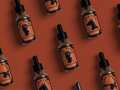
Pana Health Packaging Design


Pana Life Sciences
Deliverables: Branding, Packaging, Illustration
Branding Project: Self Initiated
Pana is a cbd oil brand dedicated to backing their products with proven science. As their company grows larger and they add more products, they wanted to give their company a facade that would appeal to the masses and exemplify their ideals. Their old label featured the goddess Panacea, the goddess of health and curing of ailments. Pana wanted to keep their signature orange and the goddess idea but move away from the medical logo look. The new look and feel is a nod to an ancient remedy, recalling ancient Greek pottery and art to evoke a sense of wisdom.
