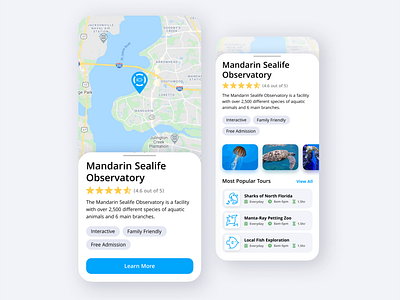
Museum and Observatory Locator
Here is the light mode of the museum and observatory app I designed. Unlike the dark mode version, this version uses bright colors to grab the user's attention and adds shadows to create depth. What's your vote, dark mode or light mode?
More by Tyler Honeycutt View profile
Like
