Creative Onboarding App Screens
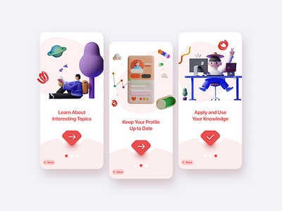
Do you love the trend of 3D icons as much as I do? I created these onboarding screens with an unusual button that catches a user's eye. I think there should always be a way "back" to where you were before in case a user missed something, but I also don't think it should carry as much weight as moving forward. I also think 3 onboarding screens is the sweet spot. Having a user scroll through more than that can often be a frustrating experience.
What do you think?