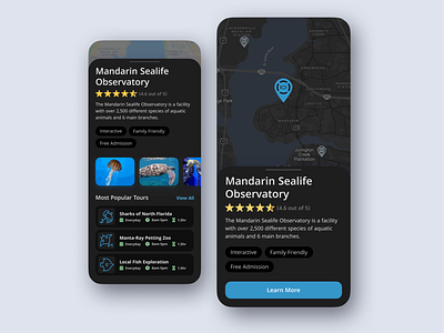
Museum and Observatory Locator
Here is a dark mode version of my observatory finder app.
I wanted to focus on things that make a good dark user interface, such as using shades of black to establish depth in the design and using slightly muted colors to increase legibility.
What do you think about the design? Would you make any changes?
More by Tyler Honeycutt View profile
Like
