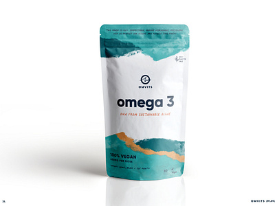
Omvits Packaging Design Sustainable Brand Identity
The ocean, a place we feel alive, invigorated, playful and in touch with nature. This concept captures that aliveness of self and the sea and links
them to the natural feeling of wellness that taking OMVITS provides.
Bright colours inspired by the sea, sun, sand, coral, algae, earth, plants and elements that are fresh, modern and positive. A handwritten font gives personality to the impactful phrases and is blended with a more traditional yet still friendly sans-serif font.
Illustrations are clean and minimal, with rounded lines. This concept is a celebration of the nature-inspired joy that OMVITS encapsulates and also wants to protect by making sustainability iconic,
eye-catching and fun.
More by Creative Wilderness View profile
Like
