Ironlak - Redesign
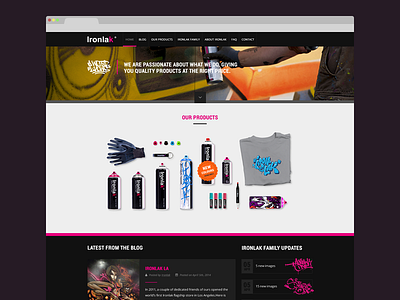
While most designers pick a more common website to redesign, I thought it seemed like a good idea to redesign the site of Ironlak, a spraypaint brand from Australia. Their paint is being used by some of the world's best graffiti writers. They post awesome stuff on their blog, but I felt like their website doesn't do them justice. So I've challenged myself to do a redesign.
You can't order anything directly from Ironlak as a customer. I think most visitors are graffiti writers, visiting the site for the blog. It's a great way to make the audience aware of your brand and keep them attached to it. That's why I've put the latest blogpost on the homepage, together with a list of the latest updates of the writer team supported by Ironlak. This way you can immediately see if there are updates.
To get to the blogpost on the homepage, you scroll past an overview of their products. Updates on newly available colors and products are shown here, because it's posted above the blog items the potential customer is always notified by new products.
The big picture at the top shows Ironlak at work and the footer features all the social media accounts.
I've enjoyed this redesign. Check the attachment for more detail, feedback is appreciated!
