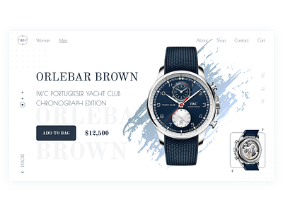
Watch Store | First screen
The concept of the first screen for the watch store. Minimalistic, restrained, but with a lot of elements that you want to consider. How do you like this concept? Convenient? Do you like the design?
More by Kalugina Natalia View profile
Like
