Doing things with my fonts: DHA4
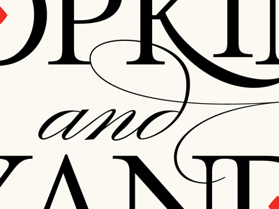
here's a detail of the script 'd'. My original that I adjusted was more compact. When I adjusted it to 'fit' better, I actually flattened the upper curve of the 'd'—thanks Ale for pointing it out…I had been staring at it far too long. In correcting that flatness, I decided to whip the horizontal resolution of the swash d back and let it curve toward the cap N below it— which further cleans up that interaction
More by Neil Summerour View profile
Like

