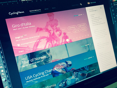
Cyclingnews races/results page
Being a huge cycling fan I spend a lot of time checking results/standings etc on Cyclingnews.com . The site is very content heavy and for a new user its a pretty daunting task finding the info you are looking for. I have been working on a concept for the site for around a week and would love to share my progress to get some feedback.
This page is the races/results page.
My aim was to reduce text but still provide all the information required to explore each race. I did this by stacking featured races in panels with only basic info about the race available until the user hovers over the section. On the hover details about the race are revealed with links to all necessary info regarding the race. Older races can be revealed with the 'view more' button. Keeping only the relevant featured races visible reduces clutter on the page.
I introduced the live feed window on the right to allow the user to follow a certain race while still exploring the site.
I will be explaining the design a little better with animations in the next couple of days, showing the hover movement and how info is displayed once clicked :)
ps. anyone got any tips on who will win the Giro?
Many thanks!

