Color Picker App Design
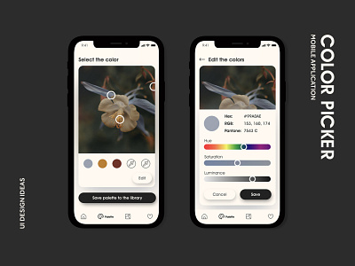
These are the screens of the color picker app interface.
The neutral colors of the interface serve to highlight the main function of the application, while the contrast details help create visual hierarchy.
The main goal was to design an easy, minimalistic and intuitive interaction, and not to clutter the interface with extra elements.
Thank you for watching, liking, commenting and getting inspired)
More by Oksana Yazieva View profile
Like
