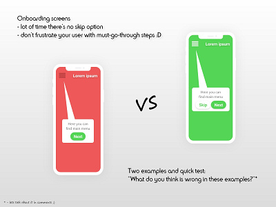
Onboarding screens aka frustrating steps without an end
I was learning new things today, about good design and stumbled upon this thing.
Either you learn something new or refresh what you already know, maybe I'll give you the right direction in your current design cycle.
Through onboarding, we may present elements on the screen, interactions maybe some hidden features, but it all needs to be skippable.
Even more frustrating I find when I have to, after clicking "Next", do that particular step. Like if explaining was not enough.
I think we need to push this article more and more into the world of user-vs-application. We need to meet the user expectations and not the application expectations.
Hope you'll have a wonderful weekend and thank you all for taking the time and reading this.
Cya ;)
