Iowa Heartlanders Brand Identity
Brand identity created for the latest expansion franchise in the ECHL, the Iowa Heartlanders.
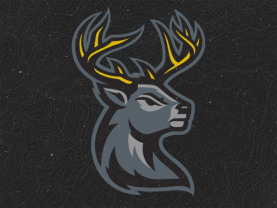
The primary logo features a proud and aggressive white-tailed buck featuring a gold “crown” of antlers that represents the animal’s status as the “king” of America’s Heartland.
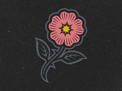
The secondary logo is a wild prairie rose, the state flower of Iowa. The color is also coral pink to be a nod to Coralville, IA, where the team will play its home games.
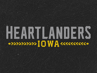
Finally the wordmark features custom typography developed from vintage Iowa license plates, with an underline that is a very stylized and abstract ear of corn.
Learn more about the team at IowaHeartlanders.com