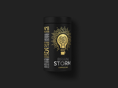
Nutri8 Packaging Design
This is a self made project to push my creative ability and test my design process to come up with something unique.
My target, the pre-workout/protein shake designs, that are associated with the same boring, bland and generic pre-workout/protein shake designs that all look the same.
I wanted to keep the packaging black because the idea for the product is coffee fusion and brand that caters to a higher end client, so it's meant to have a luxury look and feel.
The idea behind this product was not just to get you pumped up with energy but to wake your mind up and fuel your creativity.
Both the company name and product are fictional.
For the design of the product, I wanted to keep the design as clean as possible but still pushing for the artistic execution.
I set out to work with three ideas in mind, artistic, luxury and modern.
While looking into pre-workout products, I learned about a smart drug called "nootropic".
I set off to research what nootropic is and what are the effects.
The simplification of the definition is "improve cognitive function, particularly executive functions, memory, creativity, or motivation".
Taking those factors into account, along with a few others as claims, energy, memory and focus.
I began by what can be considered as "energy". In design we are thought that lines represent motion and energy. One of those types of lines can be related to "lighting" or even a bolt of lighting, which was my original concept.
But I wanted to push the concept further because I knew there was a lot more to this product.
How can more energy be explained, I started researching the cosmos/space because for one thing it's dark and the product packaging is also black, the cosmos is really surreal and completely amazing. I started looking into the sun (how it glows) and the rays of light.
Then it hit me, nootropic defines cogitative improvement and creativity, I needed to translated how this product can help people "spark and fuel" their creativity. The product is called 'Brain Storm',, the pinnacle to your success, you go to use your brain if you want to succeed.
As I said, the sun was one thing I was looking into but I was hesitant to use it because I didn't feel that it would translate well with some people. I wanted something a little closer to home.
I switched my idea around to a light bulb, it has energy flowing through it, it's a symbol of a bright idea.
Taking all my research into account I began my concept but I'm not one just for regular illustrations, I like to mix up things a little, doing abstraction, romanticism and surrealism and keeping them as minimal as possible.
I setup the light bulb with the brain inside it with an energy current flowing between the brain, while the nest of the bulb curves up from a coffee cup (like steam), lighting up and igniting a the brain's creativity, memory, motivation.
I didn't want any icons on the design that represents the benefits, I just wanted typography. My inspiration for the left side text came from typography wall art.
I decided to finish off the label, I just wanted to add one little quirk, just for a little fun. Because light bulbs have a watt unit, I turned the servings into watts, that is why it reads "25 watt serving", also another nod at 'energy'.
The final touches to add the feel of luxury is to apply gold foil and silver ink to the product.
