Bijniernetwerk - Logo Redesign 🔄


Bijniernetwerk - Logo Design
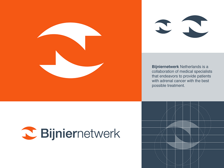
Bijniernetwerk Netherlands is a collaboration of medical specialists that endeavors to provide patients with adrenal cancer with the best possible treatment.
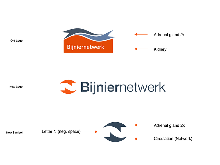
About this concept: We wanted to keep the original logo intact but only made things a bit more modern and easier to apply online and offline. I came up with the idea to make the adrenal gland in a rotation form which creates the letter N in negative space. It was just the right amount of adjustments to make it more timeless and suit their future goals.
Happy to hear your thoughts and I hope you have a great (creative) day!
Interested in working with me? Let's make a mark, together!
Bijniernetwerk - Logo Design
Bijniernetwerk Netherlands is a collaboration of medical specialists that endeavors to provide patients with adrenal cancer with the best possible treatment.
About this concept: We wanted to keep the original logo intact but only made things a bit more modern and easier to apply online and offline. I came up with the idea to make the adrenal gland in a rotation form which creates the letter N in negative space. It was just the right amount of adjustments to make it more timeless and suit their future goals.
Happy to hear your thoughts and I hope you have a great (creative) day!
Interested in working with me? Let's make a mark, together!
