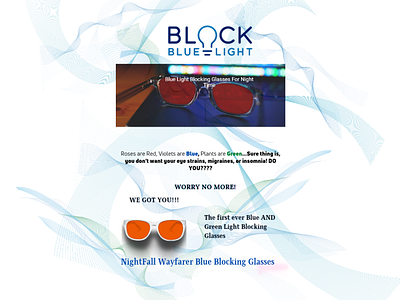
Sample Email campaign draft
I made it as a sample for an email campaign of a prospective client. I came to the idea of relating the design to the website and logo of the company itself. Since the project is about launching glasses that block blue and green light wavelengths, I decided to just use the soft strokes of lines blue and green as a background. I wanted to make it as simple as possible yet appealing and would make the product shine. I also added some context from a poem and did a lil spice to be catchy. I didn't add the price, as it should be something to look forward to on the launching day. (I wasn't able to upload the second page here, as I'm not subscribed to the pro account yet, but hopefully soon!) Cheers!
More by Roxanne Reyes View profile
Like
