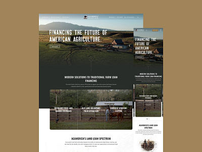
Ag America Homepage
Right off the bat we wanted to create a homepage experience that resonated with who AgAmerica’s customers are. Not only was the language focused on addressing their pain points, but we really aimed to highlight visuals they could relate with. Interactive modules like sliders contain information to mitigate overwhelming people with too much too fast. UI elements such as lines and the topographic map are used to help frame pages and promote scrolling.
More by Huemor 🚀 View profile
Like
