PostPay – Hero Section
Another day, another shot!
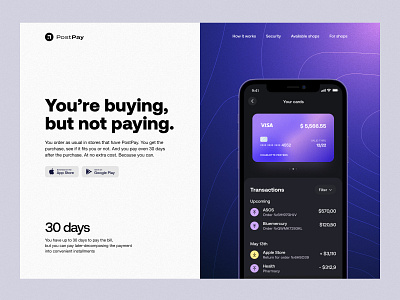
Fintech is still on top these days, so we decided to get in on this thing and show off a bit. Keeping our best traditions, we've played on a high contrast and used a beautiful gradient to catch the user's attention. And we haven't forgotten about bold typography and minimalism. This is just what the doctor ordered!
If you like this shot support us with a ❤️ reaction and follow our profile to be up-to-date 🙂
---
Follow us on Facebook / LinkedIn / Instagram
Also, visit our Magazine to read more about design, development, project management, and many other topics!
Have a project? Let's talk: hello@unikorns.work
More by Unikorns® Agency View profile
Like
