Wacom Iconography
Hi friends
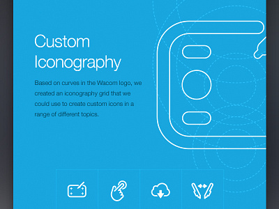
Another big part of the Wacom.com relaunch was the extensive set of Icons we developed, not only for the website but also for future packaging applications.
The Iconography was developed on a circular grid to keep the line radius & thickness consistent throughout the entire set.
The actual outline style was inspired by the already existing Wacom word mark - We just loved how well the iconography and the Wacom logo goes together and couldn't resist designing hundreds of Icons for Wacom on top of the actual web work we got hired to do.
I will share more of this in a bit.
Cheers,
Tobias