Redesign Zara Shopping Cart Page
The solution I offered are solemnly based on my personal experience visiting the site and a little research. I decided to keep the site minimal and sophisticated to reflect the upon brand's style of clothing.
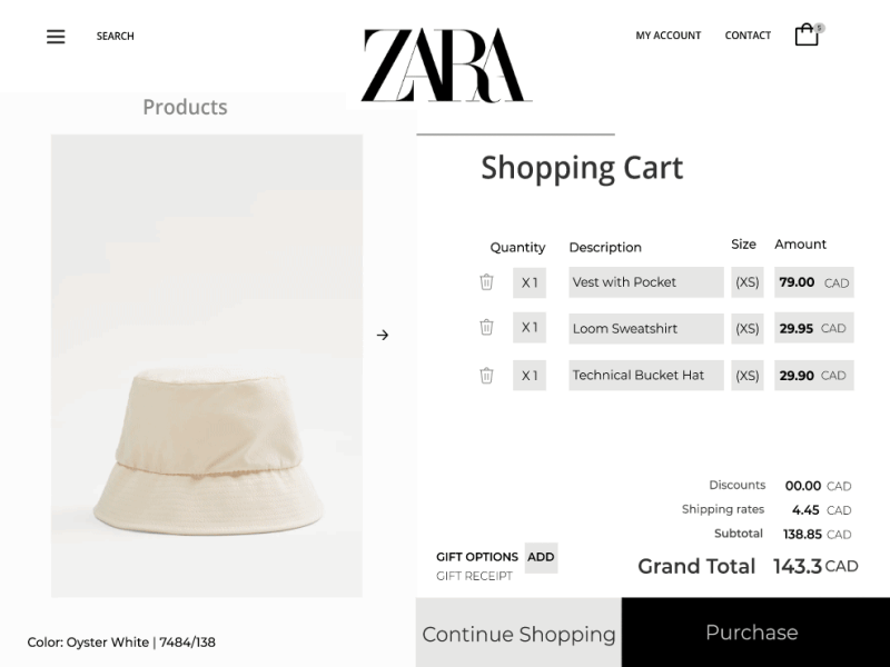
Problem - User struggle navigating on the website due to minimal contrast of text against the background and have a hard time finding the information of the selected items in cart, creating a unpleasant experience. Also no hamburger menu and Search option is found. No continue shopping button or icon found to navigate back to homepage.
Solution - Optimized the shopping cart page by adding hamburger menu and search option. Also added contact and my account option to the header menu. Shifted the product images to the left side which change when selected the particular product in the cart. with the image section I thought having the color description and size guide in case of doubt would be a great option for user to navigate. Often user happen to visits the shopping cart page in between shopping to view the products, and would like to continue shopping, therefore I added a continue shopping button which helps user to navigate back to homepage.
Would love to have your insight!!
