Saturday morning experiments with Assembla
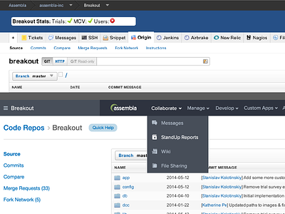
top: current ui
bottom: exploration #1
Experimenting with some new UI layout changes to smooth out the UX of Assembla. Such a great product with great tools, just gotta make it easier to use. I love early Saturday morning experiments.
Key things i'm focusing on:
1. The concept of "workspaces", I want to keep that stapled to the top left so you know what space you are in at all times.
2. I want to simplify the navigation structure so you can find your way quicker.
3. Get the primary call to action to standout.
Check out the full size too. Thoughts?
More by David Simpson View profile
Like

