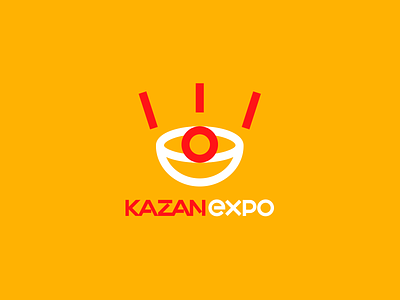
Kazan expo logo
International Exhibition Center KAZAN EXPO will be the largest exhibition center of the Volga region.
Construction of the facility will be completed in 2017.
Logo design and key elements of corporate identity involves the formation of a common approach to the use of graphic elements in all the advertising and marketing communications of the exibition space.
The graphic symbol consists of two simple and easily recognizable elements - stylized images of a kazan and an eye.
Traditional Indigenous Tatarstan symbol of unity and hospitality - kazan - was the starting point in the development of a graphic symbol. Kazan - is a national kitchen tool that boasts millennia of history. Its unique shape impart to the content a new value and a unique taste. In our case, this is the place where goes on accumulation, mixing and qualitative changing in the various "ingredients" - views, knowledge and experience.
The image of an eye represents the broadest overview of the achievements in the sphere of economy, science, technology, culture and other fields.
The original symbol, the strong and compelling font in combination with the contrasting colors create a unique brand image of the open and modern exhibition space.
