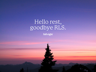
FullEight visual identity: Color palette
The color palette for the new visual identity for FullEight is based on the moment you see right before and after your eight hours of sleep: sunsets and sunrises. To stand out from competitors we decided to go for a deep purple instead of a dark blue as primary brand color, and build a versatile secondary palette inspired by the sky. We used subtle color gradients to mimic the sky, and make the colors feel alive 🌅
More by Jantine Zandbergen View profile
Like

