Tableau - visual analytics platform redesign
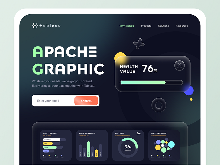
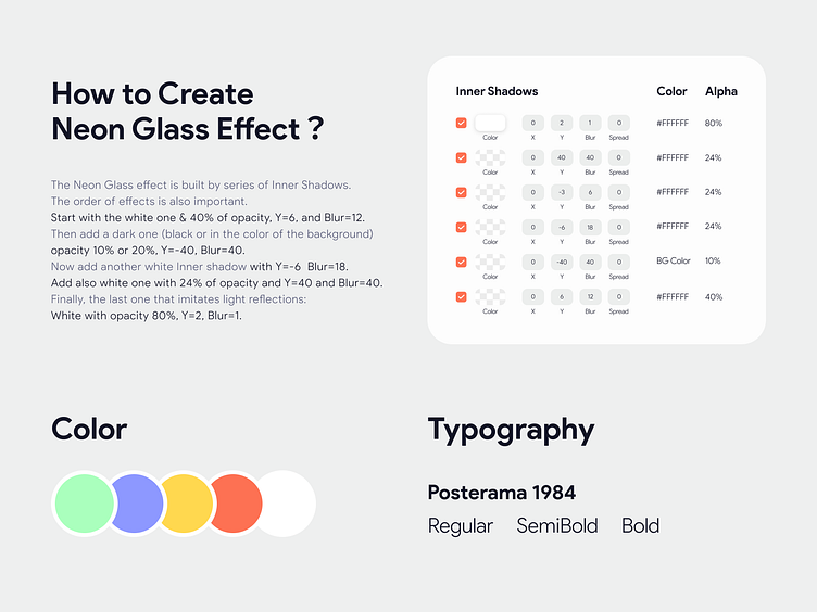
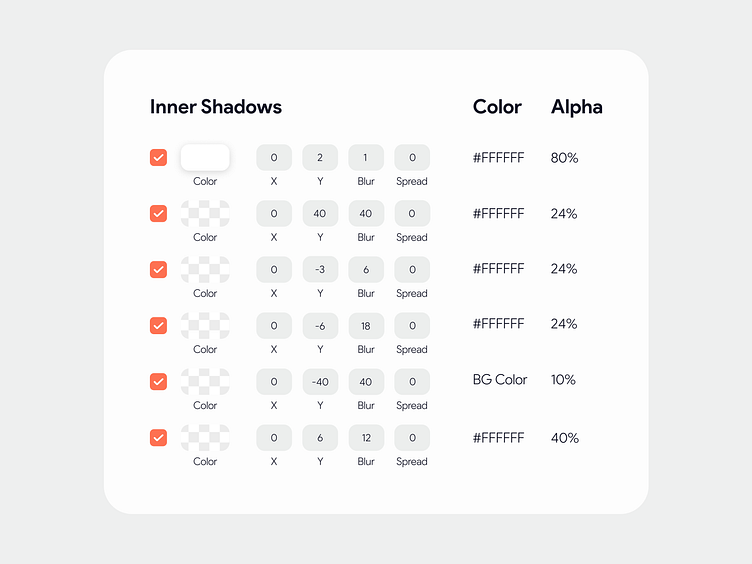
😊 Hello, a new week with Dribbbler on time. Today I'm going to bring you the landing page of a visual analytics platform in dark mode. 📃 Background: This is an attempt to redesign Tableau. Without considering the requirements of landing, I made bold exploration and attempt in design style. In the design process, I used a lot of rounded corners to make the overall interface more relaxed and lively. On the right I tried a new style: GlassMorphism. This Glass Effect UI has become popular in North American circles and is heavily used in the Visual Analytics Platform. In addition, below I will focus on presenting different data visualization charts to help users better compare and browse data. If you like GlassMorphism, I will set the parameters below, you can also get the same great effect through the design of Figma. 📖 Apply the Inner shadows The Neon Glass effect is built by series of Inner Shadows. The order of effects is also important. Start with the white one & 40% of opacity, Y=6, and Blur=12. Then add a dark one (black or in the color of the background), opacity 10% or 20%, Y=-40, Blur=40. Now add another white Inner shadow with Y=-6 Blur=18. Add also white one with 24% of opacity and Y=40 and Blur=40. Finally, the last one that imitates light reflections: White with opacity 80%, Y=2, Blur=1.
💙 Press "L" to like and give your valuable feedback. Don't forget to Follow me. Thanks for your time and have a good day! 🔥 i'm available for hire and collaboration just message me or email me for any inquiries or need some help. Don’t worry, it is secure and confidential. Looking for UX/UI Design? Learn more about my works here and contact me: Email me: 949097606@qq.com / abenzhb@gmail.com Skype me: 949097606@qq.com WeChat me: 949097606