Knife Icon
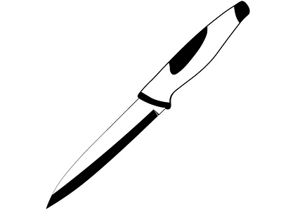
For my Language of Design class, I was given a project in which I had to create an icon of a common household object from looking at it. The first step in this project was to draw the object on paper to get a feel for how it looked and felt. The second step was to determine the essential qualities of the object, which included the blade, the handle, sharp, and strong. To convey these essential qualities, I made the stroke of the blade thinner than the handle to show how strong the handle was and how sharp the blade was. The constraints included the icon being on an 8" x 8" document and being black and white.
