Two Voices on a Page
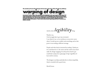
For this project, the goal was to communicate the speakers' voices through the use of typography. David Carson is known for his chaotic typography and lack of legibility while Beatrice Warde is known for her clear legibility. With this assignment, I wanted to emphasize the key points that each speaker was making, while switching the roles a little bit. I made David Carson's voice clear and legible in a serif font that you'd see in books. Beatrice Warde's voice is seen in David Carson's style where the legibility is lacking and there's an emphasis on warping of design because that's Carson's specialty.
