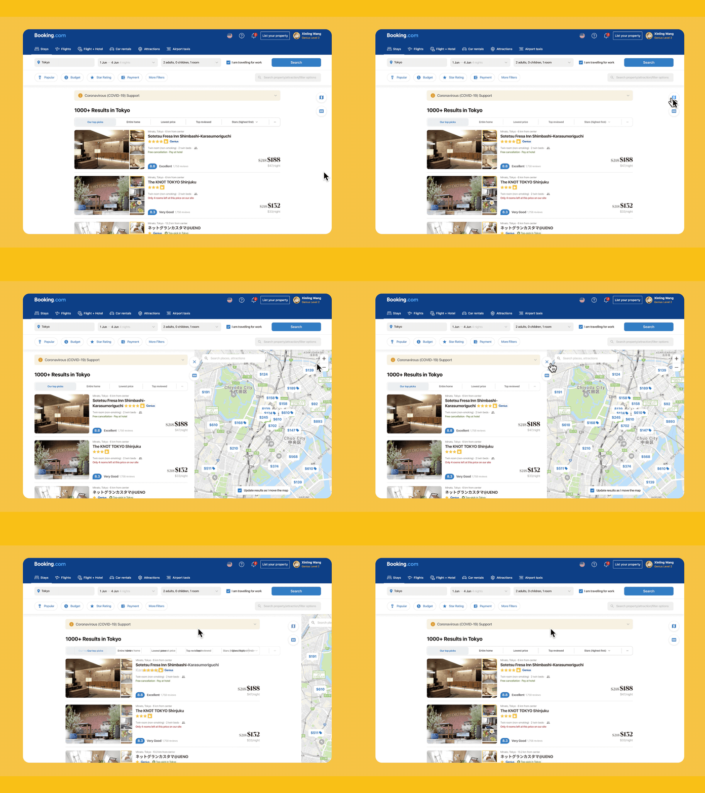
Toggle split map view on Booking (a redesign project)
Hi! I just finished a side project which is a redesign project of the search result and filter pages of Booking.com.
In my early researches, I found that the interests towards a property's geographic location actually vary to a great deal. Though Booking is providing a dedicated map view, the property card were very much distorted and obsured the normal information retrieval process.
Thus I redesigned the interaction of the toggle of map view on Booking, and here it is.
Read the full case study on Medium publication Bootcamp: https://bootcamp.uxdesign.cc/redesigning-for-a-greater-search-experience-on-booking-a-case-study-c32094d1d8cd
More by Shirley, Wang Xinling View profile
Like
