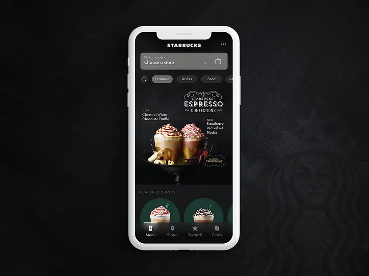
Starbucks | App Concept
I've been trying out Figma for the first time and wanted to create a quick concept.
Here is an idea for an updated Starbucks app. I use the app all the time but feel it lacks the same vibe the stores themselves have. I looked to the menus you see when walking in the stores for ideas: lovely big images and a dark theme.
More by Alex Morris View profile
Like
