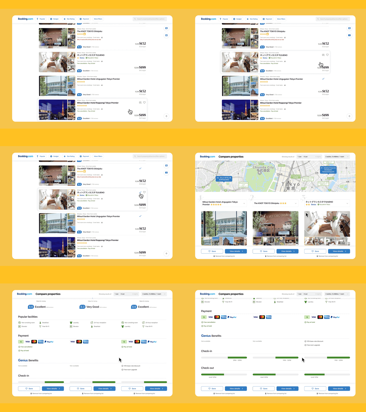
Compare hotels on Booking (an interaction design side project)
Hi! I just finished a side project which is a redesign project of the search result and filter pages of Booking.com. This comparing page is a home-brew idea with a friend when I found that needs were unmet when we got some candidates but have to switch between the tabs to cross-compare.
To my surprise, while I was working on the project, Booking also launched their comparing mode! So if you are interested, you may compare our output and share your thoughts.
Read the full case study on Medium publication Bootcamp: https://bootcamp.uxdesign.cc/redesigning-for-a-greater-search-experience-on-booking-a-case-study-c32094d1d8cd
More by Shirley, Wang Xinling View profile
Like
