Crete Mechanical Group
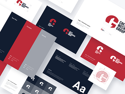
Another shot about branding for the Crete Mechanical Group. Being a US multi-site owner, operator, and business partner to mechanical service companies, they are into “serious” business so we wanted to stress it by shaping an image of the solid and reliable business partner that they are.
Chosen colors are both traditional for the US and represent professionalism. In the logo image, you can discern a hammer and an anvil from the Nebraska state flag — the place where Crete Mechanical Group started — that also symbolizes the American industry.
Have a project in mind? Contact us.