F and G House Logo Design for a Building Company

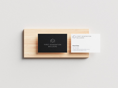


For First Generation Builders, we designed a logo mark to represent stability and structure. We constructed an outline of a house and subtly incorporated the primary initials of the company to give it a unique touch. A sharp and professional sans-serif typeface was chosen to complement the logo mark and the minimal palette gives off an urban feel.
Hop To Us To View More Projects
Follow the White Rabbit 🐇
Website | Instagram | Facebook | Behance | Pinterest | YouTube
Like what you see? contact@whiterabbit.nz