Music Homepage
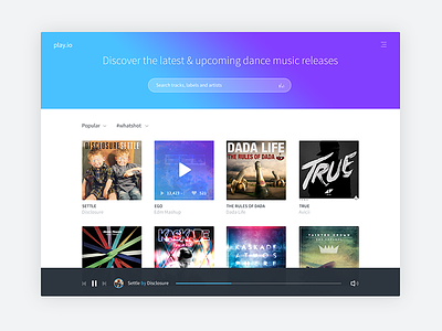
This guy I did not too long ago for a client, this version is much more different then the final one, other one is a bit more toned down. Thought I'd post this one up. Idea here was to keep it super simple, without all the bells & whistles.
Check out attached for the real thing.
Note: Thats not clients logo, this one is just filler.
More by Dmitri Litvinov View profile
Like

