Mushroom Logo Design
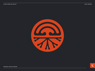
Final logo design for Spore Collective.
Spore Collective is a Brisbane based start-up growing premium quality, sustainable gourmet mushrooms, free from additives and chemicals.
Their primary goal in the early stages of the business is to sell to the food and beverage industry, as well as stalls at local produce markets. However, as the business grows there is potential to further harness ‘the power of the mushroom’ by creating a wide range of eco friendly goods, such as therapeutic and medical products, sustainable packaging and meat substitutes.
Our goal is to create a brand identity that is versatile, allowing for seamless expansion of the product range in the future. We also want to ensure our brand is modern and youthful, appealing to the ever expanding pool of environmental and health conscious consumers
This final concept uses the cross section of a mushroom, showing both the above and below ground elements. The mycelium (roots) below ground are like the web that links the fungus together, or ‘nature’s internet’. The wi-fi like shape at the top of the symbol is another link to this. The spherical shape of the symbol also represents the pertri dishes where the mushrooms are originally grown.The coloured dots in the wormark are the spores, spreading away from our symbol. A vibrant shade of orange is used as a warm and earthy colour that is associated with appetite.


