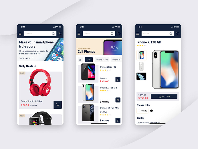
Marketplace design concept - mobile
Hi Dribblers! How about a new design concept for the marketplace? With its help, you can sell and buy goods, as well as communicate directly on the platform.
We always focus on intuitive UX and beautiful UI when working on marketplaces. It should not be a quiz for a user to get to the desired product and add it to the cart. At the same time, pleasant colors and a readable font play an important role too.
In this concept, we used an accent dark blue color and a white background. Font for titles - Titillium Web, for descriptions - Work Sans.
Don't forget to visit Codica team website for more case studies.
We create user-friendly and fast-loading custom marketplaces . Contact us to discuss your idea and get a free quote .
More by Codica | Software Development Agency View profile
Like
