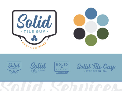
Solid Services Logo - Tiling Service
Solid relies upon a strong set of visuals that derive from a primary holding company, but showcase their respective traits distinctly. Color variations and iconography provide a clear tone unique to the industry of each channel, while still adhering to the parent brand.
The result is a full arsenal of visuals that the client is able to utilize for any possible scenario. It's always important to put the consumer at the center of your messaging, and this is precisely the approach that these logos lean on.
Primarily servicing the needs of suburban family homes, the Solid aesthetic is built around vintage-style layouts indicative of quality and service. A retro brush script and 'antique' color palette add a homegrown "All-American" familiarity to the brand.
--
Project YOUR BRAND to the market through cutting-edge graphic design!
Let's Talk Design Today!
