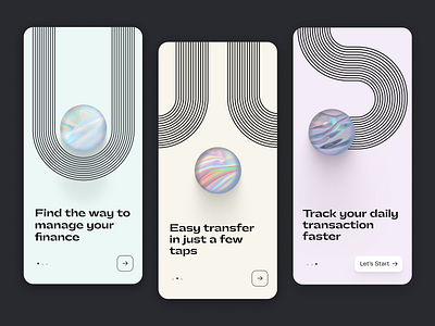
Onboarding Finance Mobile App
I've been working on this concept idea for a Finance Mobile App and I played with some UI trends of 2021.
My goal for this app is to create a platform that allows the user to trade money in the fewest taps on the device.
I was inspired by the Bauhaus' design and I used simple shapes to create visuals that can stand alone, even without any title.
I wasn't sure about filled forms because I wanted light and minimal UIs, and for this reason I used lines.
Money are fluid, and what could be better than Iridescent style, that I personally love as new trend. 🍭
Many other screens will come out in the next few days, I just wanted to launch a small release of this design progress 'cause it can be useful for someone to be ispired.
What do you think about it?
Do you use Iridescent design for your UIs? ❤️


