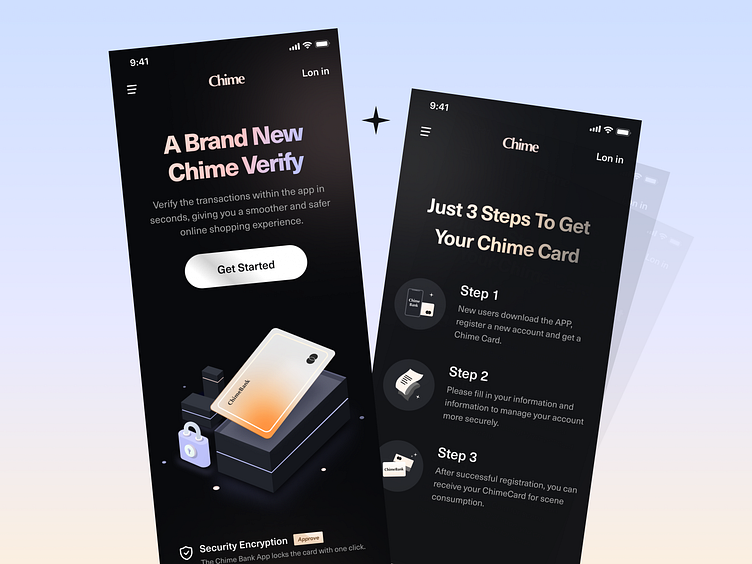
Chime Bank - Registration process mobile app
Chime Bank - Registration process landing page 🤩 Hello, a new week with Dribbbler on time. Today I'm going to bring you the landing page of a financial product in dark mode. ⏰ Time Introduction: This project is an online bank that I received from a financial client in East America in January 2021 and asked me to design for him. 📃 Background: Chimebank is a new online virtual bank in the East of the United States. This landing page helps new users register at their bank and open a virtual bank card. The selling point of the title is mainly designed around the security performance and privacy protection of the bank card, and the use of warm and cold colors can also better give users a fresh visual sense. Since new users are very unfamiliar with the registration process, I tried my best to consider the transparency of the process when designing UX and to make the steps as clear and simple as possible 💙 Press "L" to like and give your valuable feedback. Don't forget to Follow me. Thanks for your time and have a good day! 🔥 i'm available for hire and collaboration just message me or email me for any inquiries or need some help. Don’t worry, it is secure and confidential. Looking for UX/UI Design? Learn more about my works here and contact me: Email me: 949097606@qq.com / abenzhb@gmail.com Skype me: 949097606@qq.com WeChat me: 949097606
