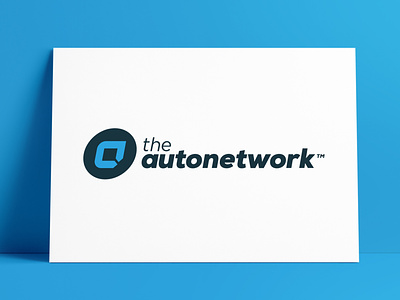
TheAutoNetwork Logo Redesigned by The Logo Smith
Presenting from the @thelogosmith aka Smith.™ Logo Design Portfolio Archive.
A Dribbble Portfolio of #LogoDesigns #LogoMarks #BrandMarks #TypeMarks #WordMarks #Emblems #Symbols #Icons #BrandIdentities
———————————
→ Client: The Auto Network
→ Designed: 2013
→ Scope: Logo Redesign
→ Project Page: Medifact.md
The Logo Smith was tasked with updating, and redesigning, the previous The Auto Network Car Lead Generation Company logo, with one that relies more on bold stylised typography for both the brand name, and the logo mark.
The new logo mark uses the initial 'a' that has visual connections to: a road, roundabout road sign, and two arrow points that meet signalling the notion of successful car lead generation.
The Auto Network Logo Construction Grid
In the case of this logo, a grid was useful in order to help keep the vertical angles the same for the 'a' logo mark, and also the slightly italicised wording.
Even the logo marks sphere is slightly 'sheared' to retain this forward leaning sense of momentum.
There are various horizontal intersections and alignments that ensure the height of the wording matches various horizontal aspects of the top and bottom of the 'a' logo mark.
Where ever possible, and if it's not to the detriment of the logo designs aesthetics, I will design in all these various alignments and intersections in order to bring harmony and interconnectedness within the logo.
The circles show key areas of vertical, diagonal and horizontal intersections and alignments, the vertical arrows generally show where space is 'equally halved' once then twice, usually relating to type baselines, ascenders and/or descenders in relation to the contained logomark.
For example the 'a' in the circle has a middle point that aligns with the x-height of 'autonetwork', which half of the x-height is equal to half the width of the a's thickness, then half of that is equal to the bottom portion of the types' counters in letters such as the: a, u, o etc
So within the negative space; the very middle of the 'a' logo mark, if we follow that horizontal line it will match the heigh of the lowercase letters in autonetwork, as well as the top of the 'a' logo mark matching the top of the 'e' in 'the'.
Each vertical, angle and horizontal line does serve a propose in this grid.
———————————
The Logo Smith aka smith.™
→ smith.gl/portfolio
→ smith.gl/hire-smith
The Logo Smith aka smith.™ – a British freelance logo designer extraordinaire – has over 28 Years Commercial Experience, in: Logo & Brand Identity Design; Logo & Brand Redesigns & Updates; Icon Design; Label & Packaging Design; Social Media Branding; WordPress Development (SEO, Security & Performance); Lithographic & Digital Printing; Reprographics; Advertising & Marketing.


