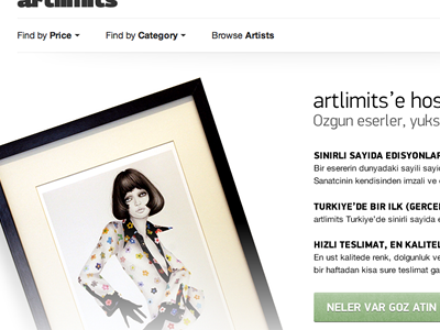
Homepage takeover
I've been working on this project for a while. It's a platform to discover & buy delicious limited edition artworks. It's called artlimits and it's Turkish only right now. Global version is on the way.
Back to this shot, we realized that our target audience doesn't know what a limited edition artwork is and how it is different from originals/posters. Instead of what we have currently on the homepage (5 featured products), -for a limited time- this page will takeover the homepage to explain the importance of artlmits.
Copy is half-dummy. The image is real, but I want to shoot a better one. Also thinking switching the main image in every 5 seconds. There will be 3 images total:
* A framed artwork, * Another framed work or a photo of the real world gallery of artlimits, * A packaging photo with Certificate of Authenticity.
With the copy being really short, we hope that people will be at least more interested and try buying some stuff.
The call to action takes people to the all artworks page where we have a set of filters to find the best artwork for you.
If you're wondering how the current homepage looks like, please go to artlimits.com.
